My monthly (first Sunday) San Francisco Chronicle Food Matters column is on guess what? This will be the last post on the new food icon for a while at least, I promise.
Food plate icon improvement of pyramid


Q: What’s the big deal over the government’s new food icon? A plate? That seems really boring.
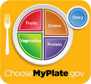
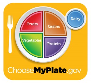
A: The Department of Agriculture’s plate may look banal, but it is a key part of first lady Michelle Obama’s healthy eating campaign and I see it as a big step forward. Unlike the 2005 MyPyramid, this one is mostly about food, is easy to understand, and does not require use of a computer.
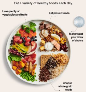
The plate does a better job of reflecting current thinking about healthy diets than previous guides. Its four sectors are unequal. Vegetables get the most space, and dairy – a discretionary choice – is off to the side.
You are to pile half your plate with fruit and vegetables, and a quarter with grains (half of them whole grains). All these come from plants.
I’m less happy about the sector marked “protein.” Protein is not a food. It is a nutrient.
USDA must think everyone knows that “protein” means beans, poultry and fish, as well as meat. But grains and dairy, each with its own sector, are also important protein sources. The meat industry wants you to equate protein with meat. It should be happy with this guide.
What I like best are the messages that come with the plate. My favorite? “Enjoy your food, but eat less.”
At last! Enjoyment is part of dietary advice. High marks to USDA for this one.
Other messages are designed to help you eat less while eating better. Smaller portions keep calories under control. Making half your plate fruits and vegetables is a profound switch from the six to 11 calorie-rich grain servings you were supposed to eat daily under the old MyPyramid.
For people who drink milk (really, you don’t have to), switching to low-fat is an effective way to save on calories, and whole grains are better for health than refined, rapidly absorbable starches that behave like sugars in the body.
So far, so good. But next come the politically charged “foods to reduce.” Here, the USDA is leaning in the right direction, but still pulling punches. USDA tells you to reduce sodium from soup, bread and frozen meals, but says nothing about salty snacks or other sodium-laden processed foods. This is a glaring omission.
And the final principle – “drink water instead of sugary drinks” – puts naturally sweet fruit juices (fine in small amounts) in the same category as sugar-added juice drinks, sports drinks and sodas, which ought to be reserved for occasional treats.
Let’s give USDA credit for going as far as it could without directly confronting the processed-food and soft-drink industries.
Optimist that I am, I think the icon has plenty for everyone to work with. It emphasizes the positives – fruits, vegetables, whole grains – and leaves lots of room for enjoyment. You can pile whatever foods you like on that plate as long as they fit within their assigned sectors.
Best of all, you do not have to count numbers of servings. If you want to control the size of your servings, just use a smaller plate.
Consider the alternatives. From 1958 until 1979, the USDA’s uncontroversial Four Food Groups advised eating two or three servings a day from dairy, meat, fruits and vegetables, and breads and cereals – half the plate from animal-source foods.
In 1979, in an effort to help reduce dietary risks for chronic diseases, USDA stacked the groups with plant foods above animal foods, eliciting a furor that led USDA nutritionists to begin a 12-year project to research a new food guide.
USDA released a food guide Pyramid in 1991, withdrew it under protest from meat producers, and re-released it a year later. Meat and dairy producers did not like being at the “eat less” top of the Pyramid. Nutritionists thought it promoted too many servings of high-calorie grains.
In 2005, the USDA replaced that Pyramid with the unobjectionable, food-free MyPyramid. This was impossible to teach (you had to know what each color stood for), eliminated any sense that it is better to eat some foods than others, and required a computer to personalize your own diet.
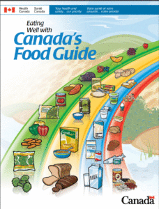
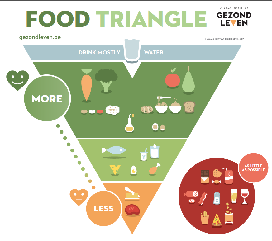
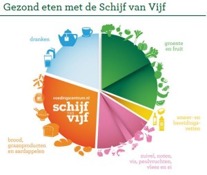
USDA officials say they spent about $2 million to research and test the new plate logo, create its website, and publicize it. This is a lot or a little depending on your perspective, but a plate is not exactly a new concept. The American Diabetes Association, American Institute for Cancer Research and Canadian government have all used similar plant-focused plates for years. The Physicians Committee for Responsible Medicine has one with a similar design but 100 percent vegetarian.
We can argue over nutritional details, but I think USDA’s plate-plus-messages works better than anything it has done before. The plate works for health and for disease prevention. It took courage to make half of it fruit and vegetables. That’s real progress.
Now the challenge is to Congress: How about fixing agricultural policies so they support these recommendations?
