

by Marion Nestle
Feb
2
2017
USDA’s latest data on food trends
The USDA has just issued a report on trends in per capita food availability from 1970 to 2014.
Here’s my favorite figure:
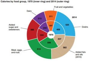
The inner ring represents calories from those food groups in 1970. The outer ring includes data from 2014.
The bottom line: calories from all food groups increased, fats and oils and the meat group most of all, dairy and fruits and vegetables the least.
The sugar data are also interesting:
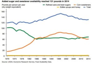
Total sugars (blue) peaked at about 1999 in parallel with high fructose corn syrup (orange). Table sugar, sucrose, has been flat since the 1980s (green).
Eat your veggies!
